Moody Colors: The Key to Elevating Home Values in 2026
Dark, moody colors represent a significant shift in home design trends. Deep greens, charcoal blues, and rich aubergines supplant the once-dominant bright whites and beiges. These hues introduce warmth, confidence, and perceived value to any space. In essence, moody colors impart an air of expense and personalization, which directly contributes to higher selling prices.
Why Moody Colors Enhance Home Value
Prospective buyers perceive moody interiors as refined and immediately habitable. Walls in soft black or deep green cabinetry appear bespoke, even within standard homes. Such elements capture attention in listing photographs and evoke strong emotional responses during viewings. Visitors recall the distinctive ambiance of these rooms, leading to expedited offers and elevated bids.
While light colors retain relevance, dark palettes now denote opulence. They indicate thoughtful selection of materials, lighting, and furnishings. Interior designers employ moody tones to anchor expansive areas, emphasize textures, and render compact rooms purposeful rather than confined.
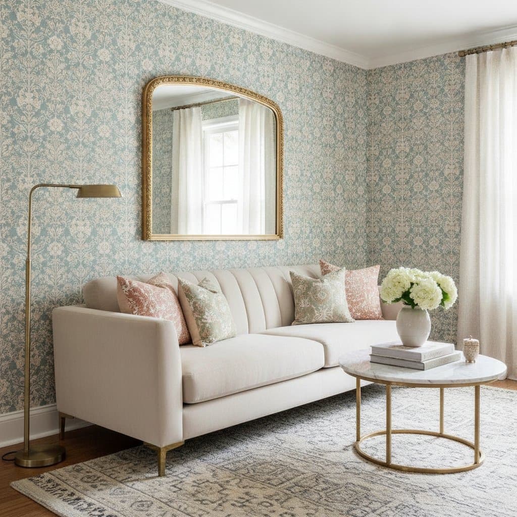
Prime Locations for Introducing Moody Colors
Initiate applications in areas primed for dramatic impact or focal emphasis. These zones thrive with added depth and contrast.
- Living rooms: Employ navy or forest green walls, offset by pale furnishings, to foster an inviting sanctuary.
- Bedrooms: Opt for deep neutrals to cultivate serene, restorative environments.
- Kitchens: Select charcoal cabinets with brass or matte black hardware for a premium appearance.
- Bathrooms: Choose dark tiles or paints that conceal water spots and evoke spa-like tranquility.
- Home offices: Utilize rich tones to minimize glare and promote focused productivity.
For hesitation, begin with a single accent wall. Position a dark backdrop behind a bed or sofa to infuse atmosphere without dominating the entire area.
Recommended Moody Colors for Implementation
Moody selections avoid dreariness through careful undertone choices that maintain equilibrium.
- Deep green: Suits traditional and contemporary settings alike; complements warm wood flooring elegantly.
- Navy blue: Offers timeless clarity, harmonizing with white trim or gold accents.
- Charcoal gray: Serves as an accessible alternative to bolder black.
- Plum or aubergine: Infuses warmth, aligning seamlessly with cream or brass elements.
- Midnight black: Ideal for accent walls, doors, or trim; matte finishes ensure subtlety.
Variations in tone and saturation define these options, yet depth remains paramount. Select pigment-dense shades devoid of grayish dilution.
Step-by-Step Guide to Incorporating Moody Colors
- Select a trial surface: Target a wall or room benefiting from ample natural illumination.
- Acquire samples: Apply swatches straight onto the wall, bypassing paper cards, and evaluate across daily light shifts.
- Incorporate balanced illumination: Integrate warm bulbs or multi-layered fixtures to sustain approachability.
- Integrate textures: Combine with wood, leather, or linen to temper the intensity.
- Proceed with commitment: Upon identifying the optimal shade, apply two complete coats for uniform results.
Deliberate testing prevents financial waste and dissatisfaction. Dark paints manifest differently on surfaces compared to their appearance in containers.
Cost Analysis
| Task | Typical Cost | Influencing Factors |
|---|---|---|
| Interior paint (per gallon) | $30 - $90 | Brand, finish type, and coverage efficacy |
| Painter labor (per room) | $300 - $800 | Surface area, preparation demands, and elevation |
| DIY supplies | $60 - $150 | Tools including brushes, rollers, tape, and protective sheets |
| Lighting enhancements | $100 - $600 | Fixture complexity and professional installation |
Regional differences apply; anticipate elevated expenses in coastal or metropolitan zones. Darker shades frequently necessitate additional primer or coats, incrementing costs while refining outcomes.
Project Timeline
Homeowners typically require one to two days per room, encompassing preparation and drying periods. Professionals halve this duration for standard spaces. Primary interruptions arise from inter-coat drying, demanding at least four hours per layer.
Concurrent lighting or trim modifications extend schedules by one day. Sequence painting ahead of flooring or decor installations to optimize efficiency.
DIY Versus Professional Services
Pursue DIY when:
- Steady precision and meticulous attention align with your skills.
- Surfaces present smoothness with scant repairs.
- Labor savings represent a priority.
Engage professionals when:
- Structures involve high or vaulted ceilings.
- Scope includes cabinetry or integrated features.
- Precision in dark-to-light transitions is essential.
Experts ensure defined edges and accelerated timelines. They specialize in primers that avert inconsistencies in tone or gloss. For resale objectives, such expertise safeguards the investment's integrity.
Essential Tools and Materials
Assemble the following:
- Angled and straight quality paintbrushes
- Medium-nap rollers
- Dark-color-compatible primer
- Precision painter's tape
- Protective drop cloths
- Stable ladder or step stool
- Stirring implements and trays
- Supplemental warm lighting for color verification
Maintain tool cleanliness across applications. Contaminants like dust impair matte surfaces.
Achieving Balance with Lighting and Texture
Layered lighting optimizes moody paints. Employ these categories:
- Ambient sources: Ceiling fixtures or recessed units for overall illumination.
- Task-oriented lights: Dedicated for activities like reading or meal preparation.
- Accent highlights: To accentuate art or material details.
Steer clear of stark white bulbs; favor 2700K warm tones for gentle radiance. Reflective metallics such as brass or bronze distribute light, countering potential heaviness.
Textures play a crucial role. Offset dark walls with lighter textiles or tactile elements like jute, velvet, or stone. This combination sustains vitality over monotony.
Considerations for Climate and Region
In high-sunlight areas, dark hues near windows may fade prematurely. Employ UV-protective paints or films to preserve vibrancy. Colder or overcast locales benefit from moody tones that enhance perceived warmth.
Humid environments demand mildew-resistant formulas for moisture-prone areas. Verify community regulations prior to exterior dark applications, as associations may restrict street-visible choices.
Moody Versus Light Color Palettes: A Comparison
| Aspect | Moody Colors | Light Colors |
|---|---|---|
| Visual Impact | Intimate, assertive, upscale | Spacious, breezy, understated |
| Upkeep | Masks grime, requires spot fixes for marks | Reveals particles, simplifies repainting |
| Ideal Illumination | Warm, multi-tiered setups | Abundant natural light |
| Value Perception | Tailored, professional vibe | Pristine, versatile allure |
Light schemes continue to facilitate sales, yet moody accents provide differentiation. In a market of uniform white interiors, a strategically darkened study or bedroom draws immediate interest.
Integrating Moody Walls with Complementary Finishes
Full repaints prove unnecessary. Dark walls harmonize with pale trim, natural woods, or patterned wallpapers. Consider these pairings:
- Navy walls alongside white trim and oak flooring.
- Charcoal cabinets with marble or quartz surfaces.
- Plum walls in bedrooms accented by linen textiles and brass lighting.
- Black in powder rooms with gold hardware and circular mirrors.
Balance contrasts through material diversity. Uniform darkness risks contraction unless robust lighting compensates.
Indicators for Professional Assistance
Summon experts if:
- Surfaces exhibit cracks, discoloration, or irregularities requiring remediation.
- Transitions span extreme light-to-dark shifts.
- Spray applications target cabinetry or fixtures.
Involve professionals for electrical proximity or elevated access needs. Prioritize safety throughout.
Certified painters provide liability coverage for mishaps and unintended applications. They excel in uniform dark pigment distribution, minimizing visible tool artifacts.
Safety and Prep Essentials
In pre-1978 homes, test for lead presence before disturbance. Utilize respirators during sanding or priming. Ensure ventilation via open windows. Secure paints from heat, children, and pets.
Position ladders on level bases. Validate samples away from utilities. Probe walls gently post-painting to avoid concealed plumbing or wiring during decor installation.
Leveraging Moody Interiors for Sales
Moody homes excel in digital listings, where dark backdrops make furnishings stand out. Agents observe that these tones obscure flaws under scrutiny.
Stage with varied textures and neutral accents to frame moody elements as intentional designs. A solitary feature room can amplify value perception when executed cohesively.
Sustaining Long-Term Appeal
Dark surfaces warrant periodic refreshments. Retain surplus paint in sealed containers for minor corrections. Employ soft sponges and dilute soap for cleaning, eschewing abrasives that compromise sheen.
Matte varieties resist vigorous cleaning; select satin or eggshell for trafficked zones. Refresh every few years to sustain depth and luster.
Strategies for Optimal Results
- Apply trim coatings last to secure precise boundaries.
- Operate under daylight conditions where feasible.
- Insist on dual coats regardless of initial opacity.
- Uniformize gloss levels to eliminate inconsistencies.
- Incorporate reflective art or mirrors to amplify light and expanse.
For multi-room projects, unify via a recurring dark motif with brighter transitional corridors. This cohesion imparts deliberate continuity to the residence.